Data visualization tools are essential in today’s data-driven landscape, transforming complex data into understandable visuals that facilitate better decision-making. As organizations grapple with overwhelming amounts of information, these tools serve as a beacon, guiding users toward insights that can shape strategies and outcomes. The array of available tools varies widely, each offering unique features and types of visualizations designed to meet diverse user needs.
From bar charts to interactive dashboards, understanding the capabilities of different data visualization tools is crucial for selecting the right one. This exploration will delve into the importance of these tools, the best practices for creating effective visuals, and the future trends that are shaping the field.
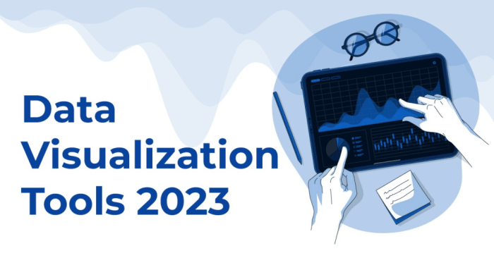
Overview of Data Visualization Tools
Data visualization has become an essential aspect of interpreting the vast amounts of information generated in today’s data-driven world. By representing data visually, organizations can uncover insights, identify trends, and communicate findings more effectively. The right data visualization tools empower users to convert complex datasets into actionable intelligence, ultimately driving better decision-making.
There are various types of data visualization tools available, each catering to specific needs and user expertise. They range from simple charting tools to advanced dashboards and interactive visualizations. When selecting a data visualization tool, several key features should be considered, including ease of use, compatibility with different data sources, customization options, and the ability to share visualizations easily.
Popular Data Visualization Tools

Among the most widely used data visualization tools in the industry are Tableau, Power BI, and Google Data Studio. Each of these tools has unique strengths and weaknesses that cater to different user requirements and organizational needs.
- Tableau: Renowned for its robust capabilities and user-friendly interface, Tableau allows users to create interactive and shareable dashboards. However, it can be expensive for larger teams.
- Power BI: This Microsoft product integrates seamlessly with Excel and other Microsoft services, making it a preferred choice for existing Microsoft users. Its pricing model is competitive, but it may have a steeper learning curve for new users.
- Google Data Studio: A free tool that offers easy integration with other Google services, making it accessible for small businesses. However, it may lack some advanced features found in Tableau and Power BI.
Successful projects have been created using each of these tools, demonstrating their capabilities in transforming data into meaningful insights. For instance, Tableau has been used by leading companies like Amazon to visualize sales data effectively, while Power BI has helped organizations streamline their reporting processes.
Types of Visualizations Offered, Data visualization tools

Data visualization tools provide a variety of visualization types, each suited for different data sets and analytical needs. Selecting the appropriate type of visualization is crucial for effectively communicating the data story.
| Visualization Type | Use Case |
|---|---|
| Bar Chart | Comparing quantities across different categories. |
| Pie Chart | Showing proportions of a whole. |
| Line Graph | Displaying trends over time. |
| Scatter Plot | Examining relationships between two variables. |
| Heat Map | Visualizing data density or intensity. |
Choosing the right visualization type not only enhances understanding but also ensures the audience can grasp the insights being presented. For example, a line graph is ideal for illustrating trends over time, while a bar chart can effectively compare sales figures across different products.
Integrating Data Sources
Integrating multiple data sources within data visualization tools is essential for creating comprehensive insights. Effective integration allows users to connect various databases, spreadsheets, and APIs, ensuring that the data visualizations are based on the most accurate and relevant data.
The procedures for connecting different data sources vary by tool but generally include:
- Establishing connections to databases through direct queries or import functions.
- Uploading spreadsheets and CSV files for quick data access.
- Utilizing APIs to pull data in real-time from external applications.
Proper integration impacts data accuracy and the overall effectiveness of visualizations. When data sources are seamlessly connected, users can gain a more holistic view of their performance metrics.
Best Practices for Effective Data Visualization

Creating clear and impactful visualizations requires adherence to best practices that enhance data comprehension and engagement. Some key practices include:
- Keep visualizations simple and focused on the main message.
- Ensure color contrast for readability and avoid excessive use of colors.
- Utilize appropriate scales and axes to maintain accuracy.
Common pitfalls to avoid include cluttering the visualization with unnecessary elements and using misleading scales.
“Choose colors that are accessible to individuals with color blindness; use fonts that are legible; and maintain a consistent layout throughout your visualizations.”
The Role of Interactivity
Interactivity plays a vital role in enhancing the effectiveness of data visualization tools. By allowing users to explore the data, interactive features can significantly increase engagement and facilitate deeper insights.
Examples of interactive elements include:
- Filters that enable users to focus on specific segments of data.
- Tooltips that provide additional information on data points when hovered over.
- Drill-down capabilities that allow users to explore data at various levels of granularity.
These features empower users to tailor their data exploration and derive insights that are particularly relevant to their needs.
Future Trends in Data Visualization
Emerging trends and innovations in data visualization technologies are shaping the future of this field. One significant trend is the increasing integration of artificial intelligence and machine learning, which enhances data analysis and visualization capabilities.
As AI technologies advance, they enable automation in data processing and offer predictive analytics that can inform decision-making. For instance, machine learning algorithms can identify patterns in data that a human analyst might miss, leading to more informed insights.
However, these advancements also present challenges, such as the need for heightened data governance and ethical considerations in data handling. Organizations must navigate these challenges while seizing the opportunities presented by these technological advancements.
Final Conclusion
In conclusion, data visualization tools play a pivotal role in making sense of the vast data landscape and enhancing user engagement through interactivity and clarity. By adhering to best practices and remaining aware of emerging trends, organizations can harness the full potential of their data to drive innovation and informed decision-making. As technology continues to evolve, the future of data visualization promises exciting opportunities for creativity and insight.